
I have worked on enough rebranding projects to see a few things that keep coming up. They are not universal rules — but they are patterns I meet often enough to be worth discussing.
I am writing about them because most companies thinking about a rebrand have the same questions and the same hesitations. And more often than not, the answers come from accumulated experience, not from theory.
You rarely need to change everything
The most common assumption companies bring to a rebranding project is that they have to start from scratch. A new logo, new colours, everything different.
In practice, that rarely happens. Usually the company already has elements that work — a logo customers recognise, a colour associated with the brand, a visual tone that has settled over time. Abandoning all of them means losing the recognition built up over the years.
What I usually do is separate what works from what doesn't. Sometimes the logo is solid, but the way it is applied has become inconsistent. Sometimes the colours are good, but the typography and the structure of the materials have evolved chaotically. And sometimes, yes, everything needs rethinking — but that is decided after the analysis, not before.
Companies that keep what works and fix what doesn't reach a more consistent result, and reach it faster, than those that want to change everything at once.
The real problem is rarely the logo
When a company says “we want a new logo”, the problem is usually somewhere else.
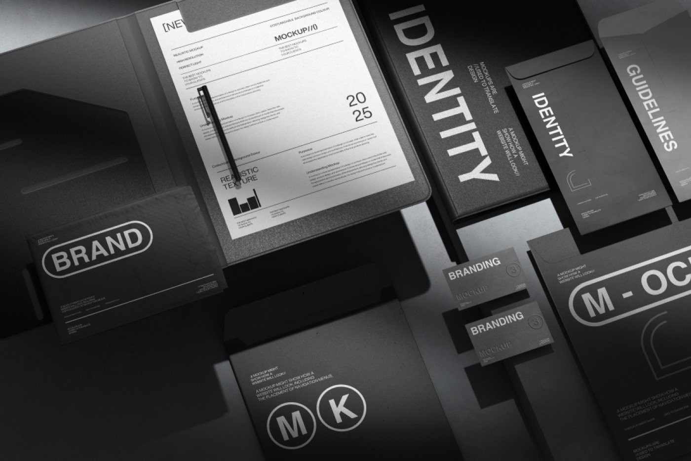
I have had projects where the logo was perfectly functional — clear, simple, recognisable — but the company's materials looked different every time they left the building. The presentation was in one style, the brochure in another, the website in a third. The logo was the same everywhere, but nothing around it connected.
In cases like these, a new logo solves nothing. What solves it is a visual system: clear rules for how colours, fonts, spacing and the structure of materials are used. The logo stays, but everything around it becomes consistent.
I have learned to listen to the initial request, but to look at the bigger picture. Most of the time, the company feels that something isn't working visually — but blames the logo because it is the most visible element. The real diagnosis only appears when I analyse all the materials together.
Rebranding works when it is a business decision, not a matter of taste
The most successful rebranding projects I have done had a concrete business reason behind them. The company was growing and entering new markets. Or it had changed its services and the old communication no longer reflected what it offered. Or a merger, a strategic partnership or a big campaign was coming up.
In all these cases, the rebrand came as an answer to a real need — not as a redesign exercise.
The projects that were harder were the ones that started from “we don't like how we look anymore.” Not because preference doesn't matter — but because “we don't like it” doesn't give a direction. If it isn't clear why the current image no longer works and what the new one should communicate, the feedback process becomes long and unpredictable. Everyone on the team has a different idea of what it “should be.”
When the reason is tied to the business — “we are entering the German market and need to look as good as the competitors there” — the direction is clear from the start. Decisions are made faster, feedback is more precise and the result is easier to evaluate.
Implementation matters as much as design
I have delivered visual identity projects I considered very good — and that had minimal impact. Not because the design was wrong, but because it was never implemented.
The usage guidelines ended up in a folder nobody opened. The presentation templates were ignored because the team was used to the old format. The new business cards were printed, but the website kept the old logo for months.
A rebrand doesn't end at delivery. It ends when all of the company's materials — all of them — reflect the new direction. And that takes an internal effort the designer cannot make.
What I have learned is to talk about implementation at the start of the project, not at the end. Who will update the website? Who handles printing the materials? Who distributes the templates internally? When these things are planned in advance, the transition happens naturally. When they aren't, the new brand stays in a PDF only the managing director has seen.
The best sign that a rebrand has worked
It isn't a design award. It isn't a compliment from a partner. The best sign is when the company's team starts using the new materials without asking anything.
When the new presentation is intuitive and someone in sales uses it without asking for instructions. When a new colleague receives the brand guide and can put together a proposal that looks just like the ones made by longer-serving colleagues. When nobody needs to check “whether it looks right” before something is sent to a client.
That means the system works. Not that the design is spectacular — but that it is clear and logical enough to be used effortlessly.
And that, in my experience, is the difference between a successful rebrand and one that only looks good in the designer's portfolio.